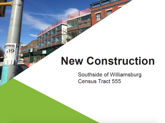
I think the poster is more clear than the slide deck. The hierarchy is clear in the poster and the questions are clear guiding points. I like the icon of construction arrow is pointing to the questions you are trying to answer. The three sections are clearly separated. They are a few typos on the slides and posters that make it a little unclear, but those can easily be fixed. I’m wondering if those colors on the census tract map mean something? Is it land-use. If so maybe you can have a legend instead of text on the poster of uses. The colors are clear and font is easy to read in the poster, but you could play around with color more in the slide deck since I only see some kind of template in the beginning slide.
For the slide deck, the census tract needs to put in a context of the surrounding Brooklyn or NYC since I can’t place where the tracts falls within Brooklyn or Willamsburg. The population data helps us understand who is the new construction being built for and the corresponding types of development needed, so this is a clear narrative. This presentation leaves me with the questions of whether it makes sense to cater to seniors and infants if they aren’t there. Is there a nearby census tract that has a higher concentration of families and seniors that would use this space? It think it makes sense for a community organization to be exploring this further about what’s needed for the area as a whole, but it’s interesting and useful to see how much development is concentrated within this particular tract is powerful.